IUI Design System
Project Overview
Industry UI (IUI) is a design system crafted specifically for creating Industry 4.0 applications. The system's primary goal was to offer a comprehensive set of components that simplify the development of robust and feature-rich websites, web apps, and mobile apps. IUI was designed with ease and flexibility in mind, enabling developers and designers to build powerful user interfaces for industrial applications without sacrificing functionality. The system supports rapid prototyping, customization, and scalability, ensuring it adapts to the complex needs of Industry 4.0.

Challenges
The challenge in designing Industry UI (IUI) for Industry 4.0 applications lies in balancing complexity with usability. Industry 4.0 solutions involve advanced technologies like IoT, AI, and big data, which demand highly functional and intricate user interfaces. The key challenge is to create a flexible design system that simplifies the creation of powerful applications while remaining intuitive for users. This requires designing components that are customizable, scalable, and compatible with various platforms while ensuring seamless integration of complex industrial data and workflows.
My Role
Design System Designer
My role was to lead the creation of a cohesive design system tailored for Industry 4.0 applications. I focused on developing a comprehensive set of UI components that balanced functionality with ease of use, ensuring that complex industrial processes were represented in a clear, intuitive way. My responsibilities included defining the design principles, creating reusable components, ensuring cross-platform consistency, and collaborating with developers and stakeholders to ensure the system met the unique needs of industrial applications.
The Process

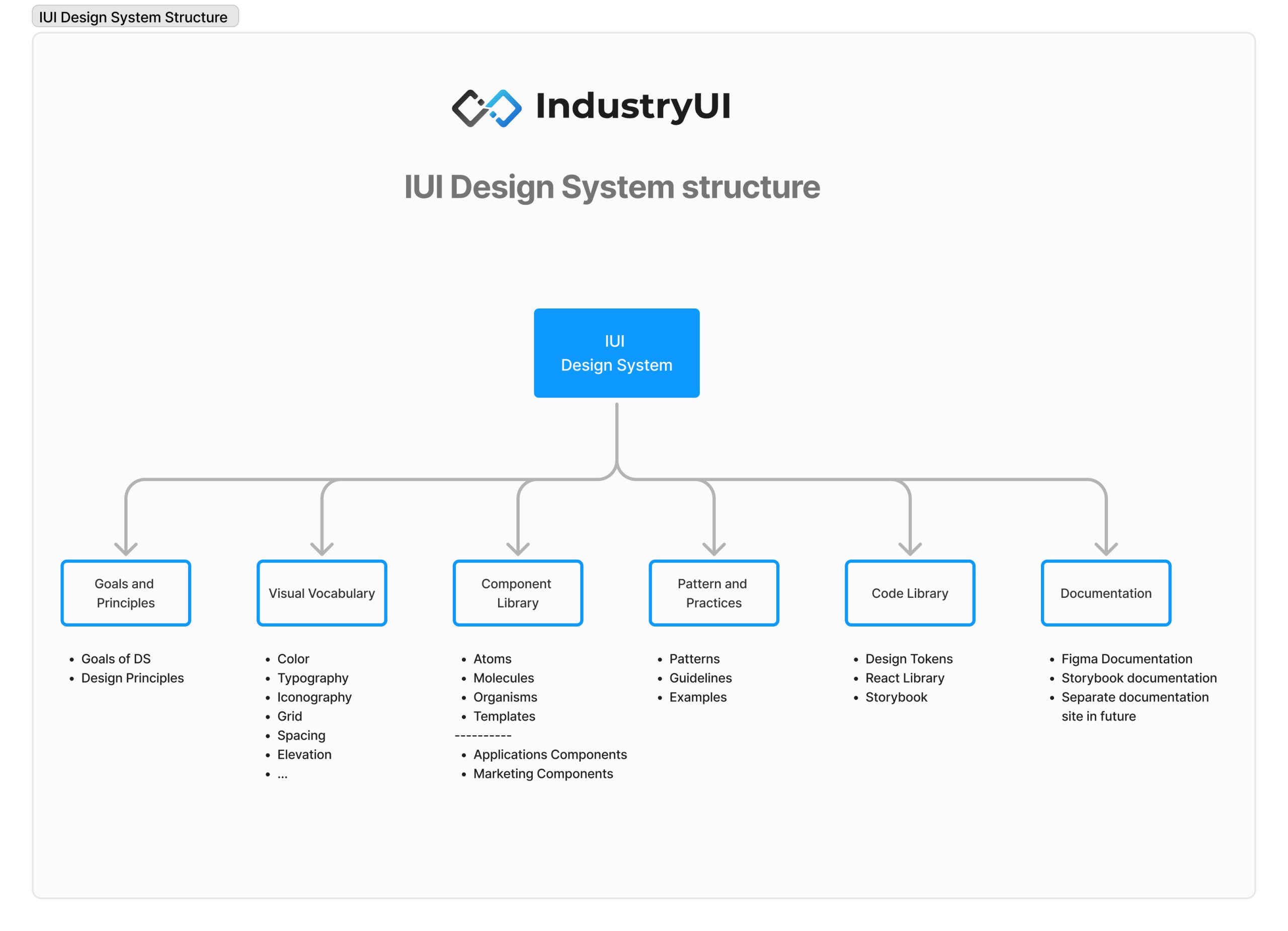
IUI Design System Structure

Goals and Principles
In the Goals and Principles section of the IUI design system case study, we focused on creating a design framework that simplifies the development of Industry 4.0 applications while maintaining flexibility and scalability. The core goals emphasize ease of use, rapid prototyping, and modularity for developers and designers. The design principles ensure that the system remains intuitive, performance-driven, and adaptable to complex industrial data workflows, allowing seamless integration of advanced technologies like AI and IoT into user-friendly interfaces. The following are the goals and principles of the IUI design system:
Goals for
design system
Design principles
Visual Vocabulary
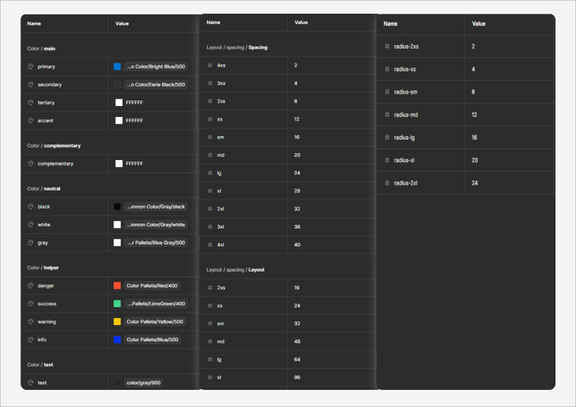
In the IUI design system, the visual vocabulary was carefully crafted to ensure a cohesive and intuitive user experience. This includes the development of core elements such as color palettes, which were designed to reflect both modernity and the industrial focus of the system, and typography, chosen for its clarity and readability across complex interfaces. Additional components, such as iconography, spacing, and grid systems, were established to maintain consistency throughout various applications, supporting a flexible yet structured design language that caters to Industry 4.0 needs.
Components
For the brand's color palette, two primary colors and one neutral color were selected to embody the brand’s values. Additionally, five complementary colors were chosen to support the main colors in various contexts. Color variations for all selected hues were also defined for use in graphic design.
For typography, three fonts were chosen: Raleway, Lato, and Playfair Display. Each font serves a distinct purpose, providing different levels of emphasis and hierarchy for the brand’s content and text.
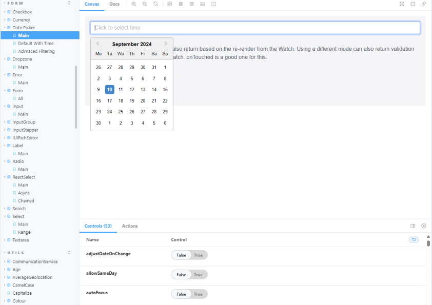
Documentation
Drawing from the elements used in the design of the main logo, a hexagonal shape was selected as the central visual motif for the brand, symbolizing concepts of technology, innovation, and modernity. This geometric shape not only aligns with the brand's identity but also evokes a sense of precision and forward-thinking. To further enhance brand cohesion, a series of patterns featuring this hexagonal motif were developed. These patterns are versatile and can be applied across various touchpoints, such as social media, banners, printed materials, and digital graphics, ensuring a consistent and visually engaging brand presence.
Conclusion
In alignment with SurgicalVR’s brand identity, a Tone and Voice document was developed to ensure all communications reflect the company's core values and resonate with its audience. SurgicalVR’s tone is designed to be respectful, simple, and helpful, effectively bridging the gap between cutting-edge technology and the needs of medical professionals.
The development of the Tone and Voice document ensures that every communication piece—from website copy to user guides—reflects these principles. This consistent voice helps SurgicalVR present itself as a trusted, approachable partner in the medical field, committed to improving surgical training with cutting-edge, user-friendly solutions.


